Hyper: A Cozy Display Typeface for Human-Centered Web Design
I was deep into the final round of tweaks on a new landing page for a ceramicist’s online studio—soft photography, warm neutrals, hand-thrown mug shots stacked like quiet poetry—and the headline felt off. Not wrong, exactly. Just… polite. Too safe. I swapped in Hyper, and suddenly the hero section exhaled. That first “Welcome to Clay & Light” didn’t just sit there; it leaned in, grounded and gently bold, like something pulled from a letterpress plate but made for today’s screen.
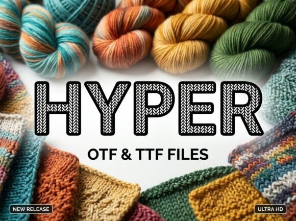
Hyper is a display typeface with tactile warmth—a bold, hollow sans-serif built for presence, not pretense. Its letterforms are open, airy, and intentionally imperfect: subtle irregularities in stroke weight, gentle rounding at terminals, and that distinctive hollow interior that catches light differently across devices. It doesn’t shout. It invites. And unlike many decorative fonts, it holds its shape beautifully at larger sizes without sacrificing clarity—even over textured backgrounds or soft image overlays.
In practice, I used Hyper for the main headline, subhead, and CTA button text (“Join the Studio Circle”). It worked because each use stayed within its natural range: hero titles, section headers, and short action phrases. I didn’t force it into body copy or navigation menus—and I’m glad I didn’t. Hyper isn’t built for long reading. It’s built for resonance. For moments where tone matters as much as information.
On mobile, I tested three things: legibility at 32px on a 375px viewport, contrast against a cream linen texture, and loading behavior. Hyper rendered cleanly across iOS Safari and Chrome Android. No blurring, no fallback flicker—especially once I confirmed the webfont package included WOFF2 and variable font support (a huge plus for performance). The hollow forms actually helped readability in low-light mode, creating subtle negative-space definition against softer backgrounds.
What surprised me most was how well it paired with Inter—a neutral, highly legible sans serif—for all supporting text. Body copy, captions, form labels, even small footer links. The contrast wasn’t jarring; it was intentional. Hyper brought voice, Inter brought clarity. Together, they created visual hierarchy without shouting: one font for feeling, one for function. For projects leaning more editorial—say, a slow-living blog or a mindfulness course page—I’ve also paired Hyper with a warm, low-contrast serif like IBM Plex Serif. It adds quiet sophistication without competing.
It’s worth noting: Hyper includes multiple weights (Light, Regular, Bold), true italics, and OpenType alternates—including stylistic sets for slightly more organic terminals and optional flourishes. I toggled those on for social media graphics and digital brand kits, but kept them minimal on the live site. Less is more when your goal is cohesion, not clutter.
Readability checks matter—especially for real users. I scrolled through the page with dyslexia-friendly settings enabled, checked contrast ratios (Hyper Bold on #F9F7F3 hits 6.8:1 against white), and verified spacing in Safari’s Responsive Design Mode. At smaller sizes—below 24px—the hollow interiors start to close up visually, so I avoided using it for anything smaller than a prominent subhead. Buttons? Yes—if they’re at least 20px tall and have generous padding. Navigation labels? No. Logo lockups? Only if the logo is wordmark-only and appears at 48px+ in hero zones.
I also double-checked licensing before deploying. Hyper is a commercial font, and the license explicitly covers web use, SaaS dashboards, client sites, and digital templates—as long as you’re serving it via self-hosted files or a licensed CDN. No surprises there, but it’s always worth scanning the EULA before adding any premium font to a production build.
Where does Hyper shine brightest? In spaces where authenticity meets intention: a boutique skincare brand’s product launch banner, a photographer’s portfolio homepage headline, a wellness coach’s “About” section opener, or a handmade goods store’s seasonal campaign tagline. It’s not for corporate dashboards or dense SaaS documentation—but it’s perfect for any digital experience rooted in craft, care, or community.
One thing I appreciated during testing: Hyper feels *designed for the web*, not adapted for it. Kerning is tight but breathable. Letter spacing defaults work out-of-the-box for headlines (I only adjusted tracking by ±2% for tighter rhythm in some cases). And because it’s a modern display font—not a script or handwritten style—it avoids the accessibility pitfalls of overly stylized letterforms while still delivering unmistakable personality.
For designers balancing brand voice and usability, Hyper offers something rare: confidence without coldness, distinction without distraction. It doesn’t ask users to decode it. It asks them to pause, recognize warmth, and feel seen—before they even read the first sentence.
If you’re choosing a display font for your next project, ask yourself: Does this typeface deepen the mood—or just decorate it? With Hyper, the answer is clear. It’s not ornament. It’s atmosphere, engineered for the screen.
- Best for: Hero headlines, section titles, CTAs, shop banners, blog headers, campaign graphics
- Avoid for: Body copy, navigation, small UI labels, data-dense tables
- Pair with: A clean sans serif (e.g., Inter, Manrope) or warm serif (e.g., IBM Plex Serif, Literata)
- Check before launch: Webfont formats, variable support, licensing scope, contrast ratios, mobile spacing
- Remember: Display fonts earn trust through consistency—not variety. Use Hyper where it reinforces your brand’s human center.