Dot Monolith Brutal: A Bold Display Font for Digital Brand Clarity
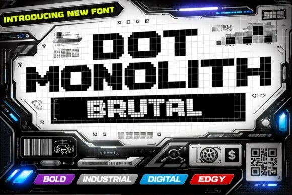
I was deep in the final layout pass for a new portfolio site—clean, minimal, but needing unmistakable presence—and opened my font library to test something that wouldn’t just sit there, but hold space. That’s when Dot Monolith Brutal landed on screen. Not as a decorative flourish, but as a deliberate structural choice: a pixel-grid display font built with Brutalist honesty—no curves, no apologies, just sharp geometry and rhythmic weight.
Dot Monolith Brutal isn’t trying to be friendly. It’s designed to be memorable, grounded, and digitally native. Every character locks into a strict grid, giving it that tactile, almost architectural feel—like seeing typography rendered in steel beams or circuit traces. It’s modular, monospaced in spirit (though not strictly), and unapologetically bold. That makes it perfect for moments where your brand needs to say “this matters” before the user reads a single word.
In practice, I dropped it into the hero headline of a boutique design studio’s landing page. Paired with a high-contrast dark background and generous letter spacing, it created immediate visual hierarchy—no extra CSS tricks needed. Users didn’t scroll past. They paused. That’s rare in 2024. The font’s clarity at large sizes—especially on retina displays—meant it scaled beautifully from desktop down to tablet, and even held up on larger mobile viewports when sized thoughtfully (I kept hero text at 48px minimum on mobile, with line-height adjusted to preserve its blocky rhythm).
Where Dot Monolith Brutal shines is in intentional contrast. It’s not meant for body copy, captions, or long-form navigation. It’s a display font—designed for impact, not endurance. Think: hero titles, section headers (“Our Process”, “What You’ll Build”), CTA buttons (“Start Building”, “Join the Studio”), product nameplates in an online shop, or even subtle logo lockups where the brand leans into digital craftsmanship.
For example, I used it for the main headline on a course sales page—a short, punchy title like “Design Systems, Decoded”. Paired with Inter for body text and light UI elements, Dot Monolith Brutal became the anchor: serious, confident, and unmistakably modern. No serif needed. No script distractions. Just clean, industrial authority.
Readability? Yes—but with caveats. On light backgrounds, it’s razor-sharp. Over image overlays, I added a subtle semi-transparent dark bar behind the text to ensure legibility without losing the raw aesthetic. For small buttons (under 16px), I avoided it entirely—its strength lies in scale, not subtlety. And while it works well on dark mode interfaces, I always tested contrast ratios manually using browser dev tools to stay WCAG-compliant.
Font pairing is where Dot Monolith Brutal becomes truly powerful. I consistently paired it with a neutral, highly readable sans serif—like Inter, Manrope, or even system fonts like -apple-system—for all supporting text. That contrast—brutal structure vs. quiet utility—creates visual breathing room and reinforces hierarchy. In one editorial blog redesign, I even layered it over a restrained serif (Cormorant Garamond) for feature headlines, letting the serif handle nuance while Dot Monolith Brutal handled gravity.
Before deploying it client-side, I checked what was included: full webfont support (WOFF2), multiple weights (though Dot Monolith Brutal is strongest in its boldest cut), OpenType features for stylistic alternates, and solid Latin multilingual coverage—enough for English, Spanish, French, German, and most Western European languages. Licensing was straightforward: commercial use permitted, including SaaS dashboards, e-commerce banners, and digital brand kits. No surprises, no hidden restrictions—just clean, professional font licensing.
It’s also worth noting how Dot Monolith Brutal performs in fast-loading contexts. Because it’s a single-weight, highly optimized display font—not a sprawling variable family—it loads quickly, especially when self-hosted. No FOIT or FOUT drama. Just crisp, confident type, in place, on first render.
I’ve used Dot Monolith Brutal on campaign landing pages where the goal was immediacy—think limited-time workshop announcements or launch teasers. Its pixel-rooted structure subtly nods to digital craft without feeling retro or gimmicky. It feels current because it’s built for screens, not adapted for them. That authenticity resonates—especially with audiences who value intentionality in design: developers, designers, educators, and founders building intentional digital products.
One thing I appreciated during testing: Dot Monolith Brutal doesn’t try to do everything. It knows its role. That makes it easier to design *with*, not around. When you choose it, you’re choosing clarity over clutter, confidence over compromise, and digital texture over generic polish. It’s not background noise—it’s the statement.
If you’re refreshing a portfolio, launching a new course, designing a product landing page, or building a digital brand kit that needs to stand out in crowded feeds, Dot Monolith Brutal is more than a font—it’s a design decision with weight, rhythm, and quiet authority. Use it where attention is scarce. Use it where meaning must land first. And always pair it with something humble enough to let it lead.
It won’t work everywhere—but that’s the point. Great display fonts aren’t meant to blend in. They’re meant to define.